La letra vasca, Basque Lettering, seems as if it were stamped out of stone, modeled upon the flayed tops and bottoms of boulders that were sought out or intentionally shaped to stand on their ends… or found that way, like the hilltop dolmens found all over Euskadi, shaped by some anonymous ancestor. In fact, this typography, deliberately designed to be perceived as very old, likely became commonplace less than 100 years ago. Hence, I use the term Basque Renaissance Typeface, in reference to it’s popularization within a relatively recent social-historical context (albeit a very long history) which I will soon clarify.
From the Oxford English Dictionary:
Font: a complete set or assortment of a type of a particular face and size – almost…
Typeface: a set of printing type of a particular design – bullseye

“A united Euskadi will never be defeated.” Source: Monografica.org
I see a Gothic style, but warmed and friendlier. I see both the sharp – authoritarian and Romantic -and the smoothed – commonly accessible, plebeian, even pastoral. The serifs (i.e. ends and corners of letters that point or flit out, as opposed to cleanly cut in a sans-serif font like used in this blog) stand firm on the ground while collecting rainwater in heavenward basins. Or are they people? With hands outstretched from broad arms, short torsos held by thick thighs steady and planted? Like anthropomorphs, the lower limbs of R’s and K’s splay out and circle back in, executing the sharp, rapid-fire kicks of the dantza and echoing the fans of the lauburu, the ever-present Basque symbol of the Sun.

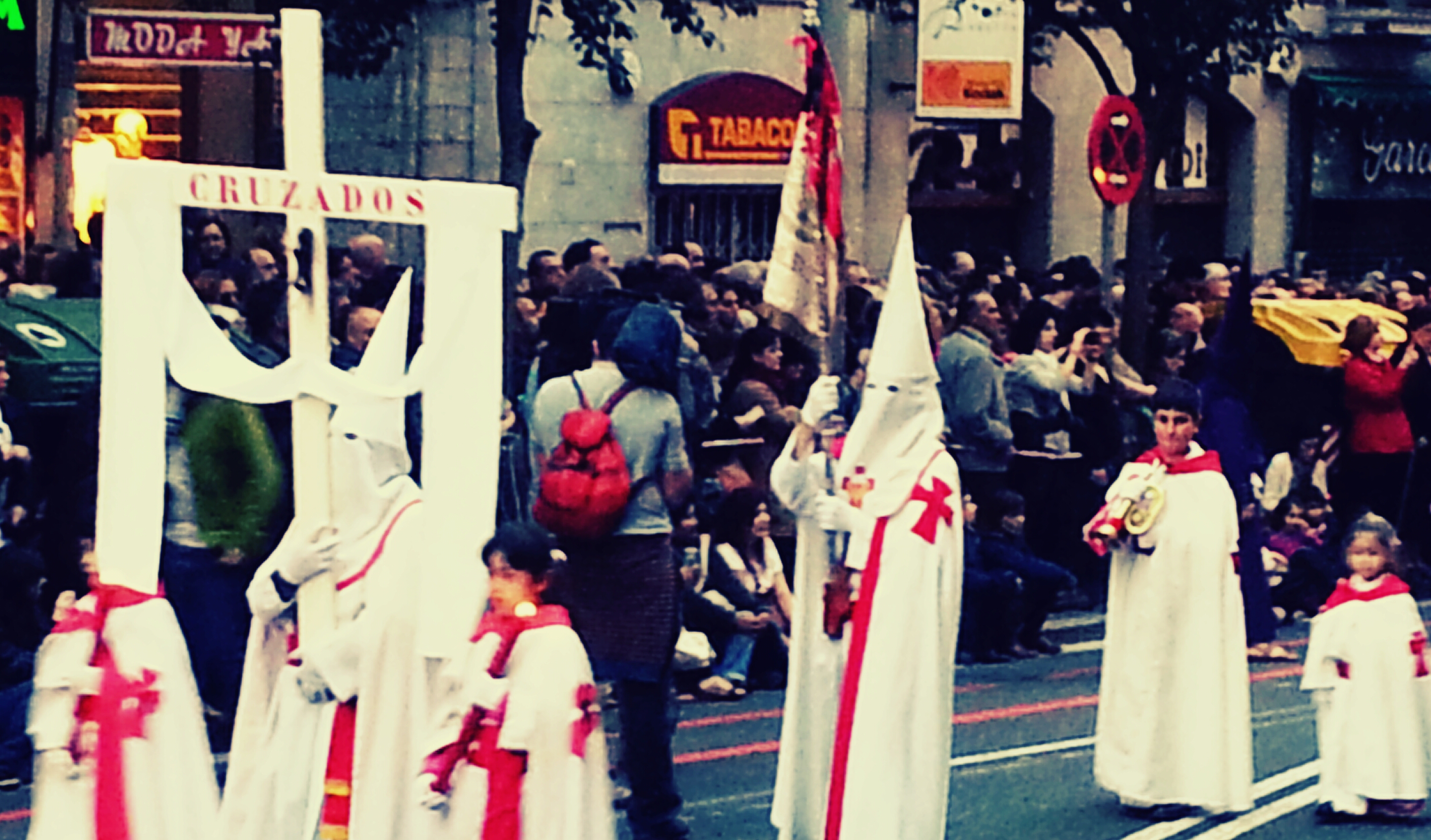
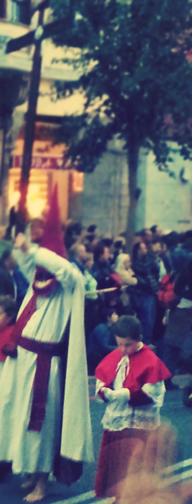
Dantza, traditional Basque dance, performed at the Basílica de Nuestra Señora de Begoña
Hence, ‘it just feels old’… Limited may be my initial observations; I just ain’t up to speed on typography like any self-respecting ‘creative-type’ of my generation ought to be… and that Helvetica documentary is still on my ‘To Watch’ list… So, a certain ‘aesthetic intuition’ drives my reasoning here. And that, perhaps, is telling of what the Basque Renaissance Typeface was molded to evoke in the viewer – an intuited, mytho-historical perspective.
Like most research towards the goal of Basque-ing In Reflected Glory, web searches in English rarely come back with the same depth and diversity as Google-ando en español. I was surprised and overjoyed to discover this frank observation, found here:
Why is such an ugly font ubiquitous in Basque Country?
It is ugly.
It looks like Comic Sans had a less attractive older brother, with huge “look at me” serifs and a weird capstone on of [sic] A that looks like a wonky Stonehenge… My suspicion is that when Basques were repressed this was a safe way to show solidarity. Would that make sense?
This commentator finds the Basque Renaissance Typeface less than pleasing, and laudably he or she still got the gist of the situation in a single sentence. Whether you like it or loathe it, this Basque Lettering is, like Comic Sans, much too exhausting to the reader for use in extended text. But as a title, name, slogan or short announcement, great.
It’s best to pause and regroup for a second, to review the history required to understand the designs’ social and political implications. I unapologetically fear I must copy-paste a few observations from folks better acquainted with the subject at hand. I think the points made by Eduardo Herrera Fernández in his article, “La letra vasca. Etnicidad y cultura tipográfica,” in the design magazine, Monográfica, are best translated and interpreted as follows; but do bear with me, as this is considerably dense, academic writing.
“La cuestión sobre la existencia de un carácter tipográfico vasco tiene sus orígenes a principios del siglo XX, coincidiendo con el movimiento denominado Euzko Pizkundea («Renacimiento Vasco») desarrollado hasta la Guerra Civil española. Tras esta confrontación y sus consecuencias de silencio y represión, comenzará un periodo de reivindicación por la preservación y exaltación de la identidad nacional y de la conciencia lingüística del País Vasco. Es por ello que los agentes sociales y de la cultura contribuyeron, con sentido práctico, a certificar una aspiración colectiva de recuperación. Se desarrollaron un conjunto de actividades creativas basadas en formas de uso y de expresión cultural.”
The existence of a Basque typographic character has its origins in the beginning of the 20th century, coinciding with the movement known as “Eusko Pizkundea” (The Basque Renaissance) that developed up until the Spanish Civil War. After this violent confrontation and its consequences of silence and repression, the Basque Country begins a rehabilitative period of preservation and exaltation of the nationalist identity and linguistic conscience. It is for that reason that social and cultural agents contributed, pragmatically, to validate a collective aspiration of recuperation. An array of creative activities were developed with the intention of communal participation in and expression of Basque culture.
“No se trata de obras individuales efímeras en el tiempo, sino de obras populares y anónimas, cuyo estilo se transmite generacionalmente, en un proceso mimético.”
The Basque Typeface is… a communal work of art, anonymous rather than having one or more ephemeral authors, and whose style, through a memetic process, has been transmitted throughout generations.

From the Alhóndiga Bilbao exhibit, “badu, bada: Euskera in a Multilingual World”
What I thought looked like the stampings of stones as the writing implement (for example, the pen), actually came from stone as media (the paper). Herrera and other sources consider the modern inception (after the Carlist War ended in 1876) of the Basque Typeface to the re-adoption of the style of funerary carvings and motifs of 17th- and 18th-century burial stones (the oldest artifacts dating back to the 9th century).
The logical follow-up to that would be… so what’s the source of that style?
My aesthetic intuition (and the objectivity of many researchers) would call on the theory of sharing, mixing and transmitting of cultural elements (AKA memetics!): this alphabet came from elsewhere and so the shapes of the letters must have too, undoubtedly Roman.
With this in mind, consider: the Basque language, Euskera, was an exclusively oral language – save a few religious writings and mercantile records – until about this same time. And so, for the first time in history, the words of this culture were now routinely expressed in a visual form. Euskera now employed no longer just the power of the ear and mouth to convey the individual and collective Self, but also the eyes. Considering what we know now about the power of images and visual clues…
“…una grafía particular, que es reconocida y denominada popularmente como «letra vasca», donde se pueden constatar motivaciones de identidad con valores específicos, de carácter político, social y cultural, y su aplicación como recurso gráfico de proyección de toda una seña de identidad nacional y reivindicativa que ha generado su propia expresión. Este tipo de letra se ha convertido en la «marca» de un grupo social y del área territorial en la que vive, reforzando la identidad social mediante la confirmación romántica del origen.”
Encapsulated in the the Basque Typeface, writes Herrera, “one can find motives for the identification with specific set of values of a political, social and cultural character, and it’s dissemination as a graphic resource results in the very distillation of the nationalism of those identified with protest. This lettering has become the “brand” of a social group and the territory in which it lives, reinforcing a social identity through the confirmation of romanticized origins.”

Source: Monografica.org
So I’ve wondered…why don’t we see the Basque Renaissance script on few-to-no modern day posters, handouts or graffiti? Despite the proliferation of the typeface used by businesses, mark trails and printed on the odd ‘Euskal Herria’ t-shirt, why do the variety of places it’s seen seem to be dwindling? Why hasn’t the script been taken up as readily by the most Euskera-fluent generation in modern history?
Before researching this piece I thought, again nudged by the imprecise compass of aesthetic intuition: Nowadays, the Basque Renaissance Typeface must evoke a sense of political conservatism, as it must be considered the lovechild (really, an adopted child) of the social democratic party (read: centrist Catholic PNV, the Basque Nationalist Party, which today pales in comparison to other social conservatisms) that initially rallied a large cross-section of the Basque population to the nationalist cause, and continues holding the regional majority to this day. That fact remains much to the chagrin of the more leftist (and typically younger) groups that continue to garner a reasonable chunk of the remaining nationalist demographic. The typeface thus must appeal, wax nostalgic even, to those who were raised around the social axis of the PNV’s batzoki meeting houses and still frequent cafes with this lettering above the entrance. But those children, now grown, could have as much resentment towards that symbology as admiration and gratitude, for their now grandfathered-in sense of identity in something no longer a novelty as it was to their parents and parents’ parents.
Again, Herrera in Monografica:
“En un proceso de desarrollo político tan complejo como el que se vive actualmente en el País Vasco, este aspecto de atribución nacionalista de la letra manifiesta una politización de la escritura que falsea la realidad social cotidiana. Así, la letra vasca implica la justificación del valor de la resistencia rural frente al cosmopolitismo, del romanticismo frente a la racionalidad, de la reacción contra el progreso. Habiéndose conformado en un verdadero símbolo, hoy en día, el carácter tipográfico vasco supone una de las manifestaciones visuales más acérrimas de una reivindicación del conservadurismo y provincialismo más recalcitrante.”
In a process of political change as complicated as is currently developing in the Basque Country, this aspect – the attribution of nationalism to the Basque Lettering – manifests as a politicization of writing which falsifies the daily social reality lived here. In this way, the Basque Typeface implies a justification of a rural-minded resistance against cosmopolitan modernity, a romanticism of origins against rationalism, and a reactionary [ultraconservative] politik against the progressive. Having been solidified as a true symbol, today, the Basque typographic character can be considered one of the most relentless visual declarations to reclaim conservatism and an even more entrenched provincialism of discrimination.
The chaotic, violent narrative of repression and marginalization lived by the old-timers pushed the pendulum of history to swing again to the other side, lighting the rebirth of a culture backed by participation and free expression. They had their great expansion of autonomy and identity, and matched it with song, symbol, and story. And now, their children and grandchildren, with visceral but increasingly indirect stories of 4+ decades of fear are now fighting their own battles, leveraging their own peace and power with the increased capacities for action and redaction… this implies a new design. To match the age, a design that is dispersed, plural. To keep up with it, returning to the past and scouting a future, simultaneously.

Source: Monografica.org
Ultimately, they’re continuing the political work of their foremothers and fathers, and in doing so point out the shortsighted philosophies (and often sexist, racist and xenophobic prejudices) that refuse to coexist with the reality of 21st century and social progress. Their entire universe is post-Civil War and post-Franco and it leads them to distinct conclusions that have to have a distinctive visual representation.
Could this have something to do with the young person’s exposure to a wider variety of aesthetic choices? I would say that thanks to the Internet and social media, the dissemination of hippy/friki/heavy/jipster-dom is prompting a Basque Renaissance 2.0… and not necessarily in the polar opposite direction of the pastoral romanticism that the Letra Vasca enshrines. It’s altogether something else, having it both ways, the juxtaposition of progress and preservation, like the last couple decades of Basque architecture, shoved together. In peace and conviviality.

Source: Juan Luis Naranjo
The typeface, often spotted carved in a relief, foreground letters projecting out from a deep brown oak woods with blond highlights, looks as though it was rubbed away at, worn down, and finally, sealed into permanency by the swelling of humidity and the drying of the sun… sometimes a light olive wood made dark, polished by the constant fumes of cooking and consuming the oil from the fruit of that same tree.
Olive trees do not grow where I live. They require much more sun and prefer much less rain. But, the territorial reaches of Euskera – and thus the territorial reaches of Euskal Herria – do include regions like Navarra that can produce this so-called liquid gold.
The non-Basqueness of olive oil and it’s pervasiveness in local cuisine speaks to the Basque-ness of cultural processes of differential definition and subsequently, appropriation = what came here from elsewhere is now ours too.
This is Basque-ing in Reflected Glory – reworking of models of the known social universe: ours is what we have re-purposed as our own.
The Basque Renaissance Typeface will, I suspect, continuously cycle through the redo’s and undo’s of ownership and authorship, and signal the precarity of a language only written down until just recently.